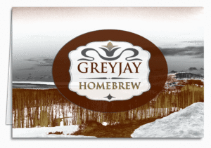
We get a lot of requests for colorization work on customers’ images, so we like to keep tabs on photography techniques both old and new. Way back in 2015 we blogged about converting images to black and white, and how to use a gradient map to achieve a rich effect. For the purposes of that conversation we were using it to maximize just two colors, but you can use more than two.
We like the idea of using branding to customize a great—or even not-so-great—piece of photography. If your business has only two branding colors, that’s fine, you can add white and/or black to get some depth in your image. Having said that, there are a lot of really cool duotones out there. So if your two corporate colors are of high contrast, rock and roll! It’ll be that much easier to get a stunning image with minimal effort.
Just as a technical consideration, the artwork you’ll end up should be suitable for either web or print. However, it’s good practice to check with the folks who will be producing your piece before going through the trouble of colorizing an image. They may have some advice on how to set up your color space. And of course, it’s a good idea to work on a copy of your photo in case it doesn’t come out the way you want and you wish to start over.
The Humble Beginnings…

Logo with three colors, four if you count white.
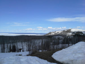
As is, this image lacks that “Wow!” factor.
The logo for this home-brew supplier doesn’t complement this unremarkable photo of Yellowstone Park at all. The challenge is how to integrate them into a unique piece of art. With a little effort and some experimentation, we should end up with handsome corporate note cards, or a design for a Christmas card they can send to their friends, customers, and business associates.
You’ll want to find out what colors you’re dealing with, so consult your corporate branding guidelines and look for the Pantone Matching Systems (PMS) numbers or CMYK formulas. In this case, we have a brick red, a charcoal grey, and a gold. They don’t really have PMS designations, but that’s okay. We could make them spot colors and name them GJ Red, GJ Grey, etc. if we needed to, depending on how it’ll be produced.
The Magic
The artist created a gradient map layer (on the right, highlighted in blue in the layers panel), and plugged in the three colors plus white. She moved the sliders around in the gradient editor (box on the left with all the colors in it), to experiment with the positioning and relationships between the individual hues. You can slide those little “stops” right past each other and see the colors in the image shifting in real time. The magic is in how the shades blend into each other. In one case she tried just the grey and the gold with white, and while the result is pretty, it didn’t fit the bill. Incidentally, you can save each iteration as a “new document” in the history pane, then move on to the next.
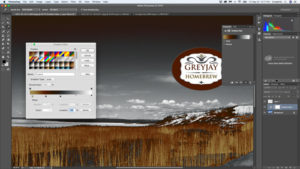
This looks a little too apocalyptic for our purposes.
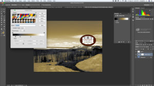
That much “gold” snow is just off-putting, though the sky is pretty.
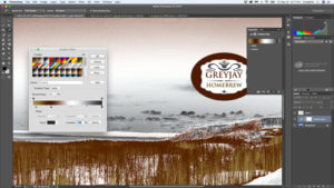
This has a nice drama to it.
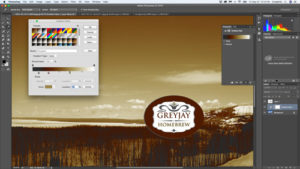
Attractive, but feels more Southwestern than Northwestern.
The Prestige
It bears noting that the result is actually a tri-tone, but is usually referred to as duotone. Whether you have your in-house graphic team work on it, or send us your photo and logo, the possibilities are exciting—such a compact and elegant form of business communication.
